


How Ecommerce Brands Can Personalize Product Discovery Around Customer Needs
Help shoppers find products that fit their needs with product quizzes, goal-based categories, buyer’s guides, comparison tables, and useful bundles.
Shoppers don’t browse ecommerce sites the way they used to. They land on a page already knowing what problem they want solved, and they expect the site to catch up fast.
A generic grid of best-sellers doesn’t cut it anymore. It forces people to do the work of translating their own needs into your product categories, and most won’t bother.
Personalized product discovery flips that dynamic. Instead of asking customers to search through everything you sell, you build pathways that respond to who they are and what they came for. This might mean quiz-based recommendations, behavior-driven filtering, or dynamic collections that shift based on browsing patterns.
The specific method matters less than the outcome. The purpose is to allow shoppers to find what fits them without digging.
Below, we’ll explain how to design your sales process based on your customers’ requirements instead of product specifications.
Use Product Quizzes to Match Recommendations to Customer Lifestyles
A product quiz turns a broad catalog into a short, personal conversation. Instead of making shoppers scroll through dozens of options, you ask a handful of questions that narrow the field fast.
Good quizzes start with lifestyle. Does the person live alone, stay active, or travel often? They also cover where and how the product gets used, since a device for a bedside table needs different features than one for outdoor activities.
Freedom of choice matters to how in control people feel, but too many options can flip that feeling upside down. Psychologists call this choice overload. It’s the reason why shoppers facing a wall of near-identical products often freeze instead of buying. A quiz simply sorts that out for them.
Start small if this is new for you:
- Build a quiz with five to seven questions, focusing on choices that actually change your recommendation, not ones that feel fun to ask.
- Place it somewhere visible, like your main navigation or homepage, so shoppers find it before they start browsing alone.
- Connect every answer combination to specific products ahead of time, so results feel accurate.
- Show a short explanation with each recommendation, telling shoppers why that product fits their answers.
This builds trust and cuts down on returns from mismatched purchases.
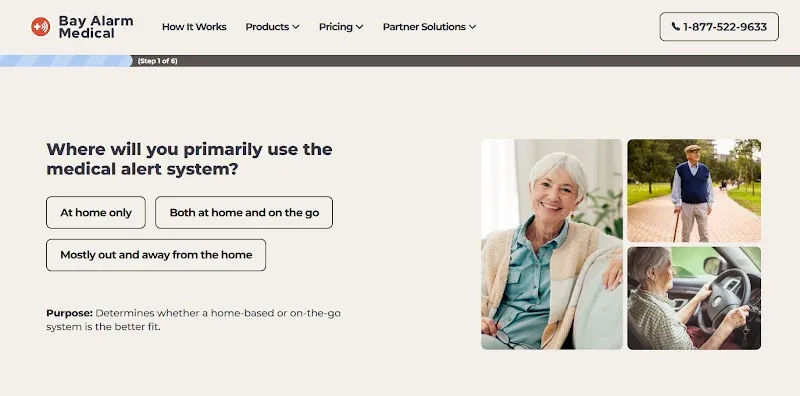
An excellent example of this approach is Bay Alarm Medical, a company that makes wearable alert devices for seniors and people managing health risks at home.
Their product quiz sits right in the main navigation, so shoppers can reach it from anywhere on the site, including the blog.
Say someone lands on their “SOS Micro, Mobile or Smartwatch – How to Choose” post while comparing devices. They don’t need to search for the quiz separately. It’s one click away, ready to turn their reading into a personalized recommendation without losing their place.
Source: bayalarmmedical.com
Organize Categories Around Shopping Goals
Standard product categories organize items by their type, but customers rarely shop using those definitions. A person buying running shoes focuses on distance, terrain, and foot type rather than the general category of footwear.
If a store uses only traditional taxonomy, shoppers must put in extra effort to match their goals to that structure. Goal-based organization changes this by creating collections, filters, and landing pages based on the outcomes customers want.
This approach involves grouping products by budget, skill level, use case, available space, or a specific problem. Navigation paths that reflect these goals help shoppers find relevant options more quickly because the site uses their own criteria instead of requiring them to interpret a technical hierarchy.
To apply this method:
- List the primary reasons customers purchase your products instead of just listing the items themselves.
- Create filter options and landing pages based on these reasons.
- Use labels that reflect the specific language customers use to describe their needs.
- Test these filters by asking people who are not on your team to locate a particular product using only the categories you provided.
- If they have difficulty finding the item, you should adjust the structure.
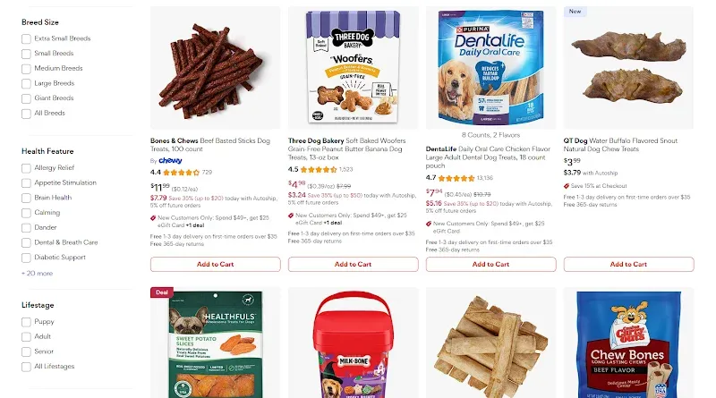
Chewy, an online retailer supplying food, treats, and health products for dogs, cats, and other household pets, shows this approach well.
Rather than sorting everything by brand or product type alone, they layer in filters tied to real shopping goals. For instance, their dog treats page includes a sidebar where shoppers can filter by breed size, health benefits, life stage, special diet, and more.
Someone shopping for a senior, large dog with joint issues can narrow results in seconds, without going through treats meant for puppies or unrelated dietary needs. The filter structure does the sorting work that a single flat category page simply can’t.
Source: chewy.com
Use Buyer’s Guides to Connect Product Features with Real-World Needs
Spec sheets tell customers what a product has, but they rarely tell customers what to do with that information. A buyer’s guide achieves that by translating raw specifications into recommendations tied to actual situations.
Instead of listing features or measurements on their own, a well-built guide explains which specs matter to someone converting a tub to a walk-in shower, or to someone hauling gear versus carrying passengers.
Brands can organize this guidance around terrain, climate, equipment compatibility, how often something gets used, and which performance factors matter most for a given task. This structure lets shoppers skip the technical translation work themselves and jump straight to an option that fits their specific setup.
To build an effective buyer’s guide:
- Identify the two or three variables that most affect which product someone should choose.
- Group your recommendations around those variables instead of listing every feature equally.
- Use plain comparisons, like showing which option handles rough weather best versus which one prioritizes an indoor setting.
- Update guides regularly so they reflect current inventory and changing customer needs.
- Link them directly from relevant product pages so shoppers find them at the right moment in their search.
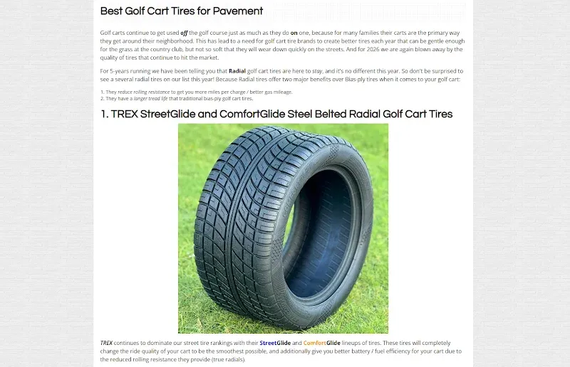
Golf Cart Tire Supply, a retailer selling tires and accessories built for golf carts, applies this well with their “Top 9 Golf Cart Tires of 2026” guide.
Rather than presenting tires as interchangeable, they organize the list around terrain type, cart setup, and what different drivers actually need from their ride. A shopper dealing with hilly courses gets pointed toward tread patterns suited for grip, while someone driving mostly on paved paths sees options built for comfort and longevity.
The guide turns technical tire specs into decisions people can make confidently, without needing to understand tire engineering themselves.
Source: golfcarttiresupply.com
Use Comparison Tables to Make Similar Products Easier to Evaluate
When products look nearly identical from a distance, shoppers need a fast way to spot what actually sets them apart.
Comparison tables solve this by pulling the features that matter most, like size, price, or key specs, into one shared view instead of scattering them across separate pages. This format saves people from bouncing between tabs and trying to remember what they saw two products ago.
Usability testing on sites with detailed, feature-rich products found that 67% of participants used a comparison table when one was available. Some felt confident enough to add an item straight to their cart from inside the table, skipping the full product page entirely.
That level of trust comes from giving shoppers exactly the information they need to decide, laid out clearly enough that hesitation drops away.
To build one that works:
- Pick the three or four attributes your customers weigh most heavily before buying.
- Skip minor specs that don’t actually change a decision.
- Keep labels consistent across every row so shoppers can scan down a column instead of reading each cell from scratch.
- If your catalog supports it, add a direct purchase option inside the table itself, since some shoppers will be ready to buy without ever clicking through.
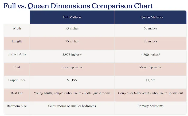
Casper, a sleep products company known for mattresses, pillows, sheets, and other bedroom essentials, puts this into practice on its “Full vs. Queen: Size and Comparison Guide” blog post.
The guide includes a dimensions comparison chart that lines up width, length, cost, and other specs for each size directly against each other.
Instead of forcing readers to cross-reference separate size charts, Casper hands them a single table built around the exact question they came to answer.
Source: casper.com
Use Bundles to Recommend Products That Work Together
Shoppers often don’t realize everything a task requires until they’re mid-purchase and missing a piece. Bundles solve this by surfacing related products at the moment someone’s already committed to a use case, rather than making them return later for accessories they didn’t know they needed.
Features like “Frequently bought together” show items other customers paired with the one being viewed, while “Complete the setup” prompts fill in gaps for a specific project or routine.
Curated kits take this further, grouping compatible products around one shared purpose from the start, so shoppers get a complete solution in a single decision instead of assembling one piece by piece.
To implement this:
- Look at your own purchase data, support tickets, and reviews to find products that customers often buy together.
- Then build bundles around those patterns instead of guessing.
- Present bundles at checkout-adjacent moments, like product pages, in the cart, and in post-purchase emails, where adding one extra item feels like a natural next step.
- Label each addition clearly so shoppers understand exactly what they’re gaining by saying yes.
- Price bundles to reward the larger purchase.
- Keep bundles flexible so shoppers can add or remove items.
- Update them as inventory changes.
A simple bundle strategy lifts revenue and directly improves the customer experience at the same time.
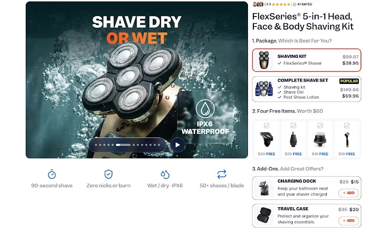
Freebird, a grooming brand built around electric shavers, structures its shopping flow around this idea.
On its shaving kit page, customers can choose between the standalone shaver or a complete shave set that adds shave gel and post-shave lotion, positioned as the more popular option. From there, the page adds four grooming tools at no extra cost, followed by optional add-ons like a charging dock and travel case.
Each step builds naturally on the last, so by checkout, shoppers can assemble a full routine instead of a single tool.
Source: myfreebird.com
Final Thoughts
Personalized discovery works because it removes the burden of translation. Shoppers already know what they need, so your job is to build a store that speaks their language back to them. You can do this through a quiz, a filtered category, a buying guide, a comparison table, or a bundle that saves them a second trip.
The best thing about these tactics is that they don’t require a full site overhaul to start. Pick the one that matches where your customers get stuck most often, whether that’s narrowing down similar products or figuring out what else they need, and build from there. Test it, track how shoppers actually use it, and adjust based on what they click, skip, or add to their cart.
This will transform you into a brand that caters to its customers in the moments when they need it the most. Your conversion rates will reflect that efficiency.
